Journal / 文章
我不想把每一天都修成粉色
我很喜欢粉色,但阴天、路灯和人的肤色,还是应该保留拍摄时的样子。
I do not want to edit every day into pink
我确实很喜欢粉色。买小东西会先看粉色,做网站也很自然地选了粉色。可是修照片时,如果每一张都套上同样的色调,几天以后再翻,我反而分不清它们原本拍在什么天气里。
武汉的阴天偏灰,傍晚路灯有时发橙,教室里的日光灯会把肤色照得有点冷。这些颜色不一定讨喜,却是现场的一部分。我会调曝光和白平衡,但现在很少再把所有照片拉向同一个粉色。
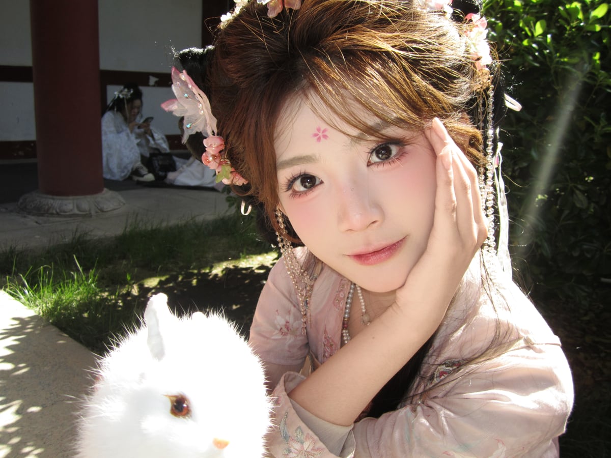
人像也是一样。磨皮太重以后,脸上的纹理没了,光线也像贴上去的。我更愿意多花一点时间选光线和角度,保留当时真实的表情。
所以网站用粉色做背景、按钮和小图案,照片本身尽量少受它影响。这样一张阴天的校园和一张重庆夜景放在一起,仍然能看出它们来自不同的地方、不同的时间。
喜欢一种颜色,不需要让它占满所有东西。给别的颜色留位置,粉色出现时反而更好看。
Read the English versionI love pink, but cloudy skies, streetlights, and skin tones should still look like the moment in which they were photographed.
I really do love pink. I notice the pink option first when buying small things, and choosing pink for this website felt natural. But when every photograph receives the same tint, I return a few days later and can no longer remember what the weather actually looked like.
Cloudy days in Wuhan are gray. Streetlights at dusk can be orange, and classroom fluorescents sometimes make skin look cool. These colors are not always flattering, but they belong to the scene. I adjust exposure and white balance, but I rarely pull every image toward the same pink now.
The same applies to portraits. Heavy skin smoothing removes texture and makes the light look pasted on. I would rather spend more time choosing the light and angle while keeping the expression that was really there.
The website can use pink in its background, buttons, and small details while leaving the photographs mostly untouched. A cloudy campus and a Chongqing night can then sit together and still look like different places and times.
Liking one color does not require filling everything with it. When other colors have room, pink looks better too.